As the saying goes, “First impressions are often the best impressions” and it lasts beyond that very moment! This holds true for your OnlyFans Cover Photos as well!
While you might have the best content, an interesting range of offerings, or the best pricing, but what if your cover photo gives off a dreary vibe? That said, the OnlyFans cover photo is the most overlooked aspect by creators!
Although it seems insignificant, your cover photo is the first thing that grabs the user’s attention. In this blog, we suggest some fantastic OnlyFans cover photo ideas that could work like a charm! So, are you ready to grab ’em by the eyeballs?
Table of Contents
- 1 Why is OnlyFans Cover Photo Important?
- 2 What are the Recommended OnlyFans Image Specifications and Format?
- 3 Which are the Safe Zones for Your Images?
- 4 7 OnlyFans Best Cover Photo Ideas That Works
- 5 OnlyFans Background Ideas
- 6 Best Practices to Create Visually-Appealing OnlyFans Cover Photos
- 7 How Often Should You Update Your OnlyFans Cover Pic?
- 8 What are the Different Tools for Creating a Captivating OnlyFans Cover?
- 9 Conclusion
- 10 FAQ-Related to OnlyFans Cover Photo Ideas
Why is OnlyFans Cover Photo Important?
We shouldn’t judge a book by its cover, but that’s what we do the most!
Here’s why the OnlyFans cover photo is an essential element in your content strategy:
-
Hook
Why do some creators struggle to make even $15K monthly while others find their way to the top echelon? Of course, your offerings and promotions are crucial, but your profile and banner photo could also matter! That said, these two are essentially like an opening hook of a social media post!
-
Niche & Tone
Your profile and cover photo also speak about your niche, content type, and personality. In fact, a stunning photo makes your profile more memorable and noteworthy.
-
Defines USP
Your OnlyFans cover photo defines your unique story and brand. Hence, it’s a powerful tool for standing apart from the creators’ rat race!
-
Branding
Your cover photo is a crucial aspect of your branding. Use a consistent image, color palette, font and logo across your cover photo, social media posts, and website. A high-quality and professional cover photo defines a good image as a creator.
-
A Window to Your Offerings
Your banner image and bio are like teasers to your profile. If you are offering a paid subscription, it’s your profile and cover photo that would be your dealbreaker! Including your services in your cover photo could win you prospects from OnlyFans suggestions.
-
Builds Trust
A professional and appropriate cover photo creates an impressive image! This, in turn, builds trust and earns you revenue in the long run!
What are the Recommended OnlyFans Image Specifications and Format?
While there isn’t a golden rulebook for choosing the right banner image, there are some standard guidelines that you could follow!
Banner Size and Dimension
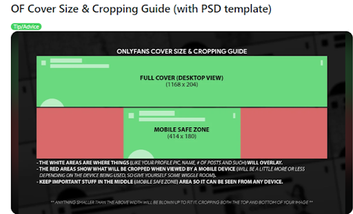
Like social media banners, OnlyFans also has a recommended banner size. However, the platform has changed the recommended cover size several times, confusing creators. Although 1168 x 204 pixels is the recommended desktop size, a larger size helps avoid the cut-offs.

For example, you could start with the following bigger sizes:
- 1198 x 360 pixels
- 1797 x 540 pixels
- 2000 x 552 pixels
- 2396 x 720 pixels
Later, size down, focusing on the essential areas. However, the banner image size varies across all screens. For instance, the above size won’t work for mobile users. The banner will be cropped and resized to 390 x 180 pixels to fit the vertical screen.
So, make sure that the essential sections of the image are placed in the middle, considering the “safe zones.”
File Type
Pixelated, blurry, low-resolution images are a big no-no for OnlyFans cover photos. Choosing the right file format is the best way to ensure high-quality images. JPEG and PNG are typically recommended for OnlyFans headers.
Plus, the total file size should be within 2 MB for quick loading. After all, isn’t the spinner throbber annoying?
Aspect Ratio
Aspect ratio is the ratio of the image’s width to its height. Typically, OnlyFans aspect ratio changes across screens. It is around 5.73 for desktops due to the wide screen size, while for mobiles a smaller aspect ratio is preferred.
Orientation
Considering OnlyFans cover photo’s wide dimensions, a landscape or horizontal orientation is an ideal fit. This helps viewers see the image content, logo, or text clearly. You can also use vertical orientation to combine multiple images in a collage style!
Which are the Safe Zones for Your Images?
Before we uncover new OnlyFans banner ideas, let’s look at some common fallouts!
-
Profile Photo
When a profile appears in the OnlyFans suggestion list, the profile pic is enlarged and covers most of the bottom left frame. So, make sure the important sections of the image are placed in the middle.
-
Name Overlay
Another thing to look out for are name overlays that appear when the profile appears in the suggestion list or newsfeed. Typically, the bottom of the banner image takes a darker shade, highlighting the profile name. It overlaps any text or essential information in the cover image.
In the above cover pic the bottom section has a darker shade that overlaps any relevant text or image aspects underneath it.
7 OnlyFans Best Cover Photo Ideas That Works
Looking for some amazing OnlyFans header image ideas? We have curated a list of amazing cover photos!
-
Wide Photo
One of the biggest mistakes creators make for banner images is to use vertical images. But a horizontal image of yourself works best for banner images! Try elongated poses like lying down or a top-down view.
-
Photos Highlighting the Most Important Aspect in the Middle
Another idea that works for banners is to highlight the most important part in the middle of your cover pic. This could be an appealing feet pic or a particular body part you wish to highlight.
-
3-Up Style or 4-Style(Multiple photos)
If a single image doesn’t prove your prowess enough, use a mosaic-style header. A great idea is to use multiple images and create a 3-up or 4-up-style header image! Creators can express themselves in different looks and easily captivate their followers.
-
Dramatic Black and White Formula
If you wish to give a unique twist to your cover image, try experimenting with black and white gradients. They are great for playing with shadows and lights and convey a unique story! The symphony of black-and-white cuts down the background noise and brings the focus on the subject!
-
Activity-Based Photos
Do you wish to flaunt your niche? An excellent idea is to capture yourself excelling in the specific craft. For example, if you are a fitness enthusiast, capture a moment of sweating out during a cardio or strength training session.
-
Themed Costumes
If you are into cosplay, create an amazing photo cover of yourself in a specific costume or character. This way, fans can easily get an idea of your offerings and subscribe to your content if they like it.
- Embedding Text and Logo Creatively
Being creative never goes unnoticed! You can choose a cool font style, color and embed your name, logo or even your OnlyFans services in your header image.
OnlyFans Background Ideas
While you might focus on finding the ultimate pose and the right orientation, backgrounds are also equally important! Blurry, noisy backgrounds with poor lighting could take away the focus from the best of your photos.
These are the finest background ideas that could take your photos to the next level:
- Relaxed Bedroom Backdrop
- Living Room Settings
- Scenic Outdoor Settings
- Backdrops like Gyms, Swimming Pools
- Digital Backgrounds
- Hotels and AirBnbs
Best Practices to Create Visually-Appealing OnlyFans Cover Photos
Here are the few best practices for creating eye-catching banners:
- Create high-quality images with an advanced phone or professional camera.
- Showing your face in the pictures is essential for winning your followers’ trust.
- Choose a photo specific to your niche so fans have a clear idea of what you’re offering. For example, if you’re a fitness trainer, choose your workout pic. On the other hand, posing in a fascinating cosplay costume is excellent for cosplayers.
- Avoid posting group photos for cover pics, as this might confuse your fans.
- Choose a header image consistent with your brand and use the same logo and font colors.
- Don’t use stock images, or use them only if it isn’t copyrighted.
- Adjust the images and text within the banner’s safe zone.
- Use photo-editing software like Photoshop or GIMP to create professional-looking images.
- Save time by using templates and backgrounds that fit your content and niche.
- Update your banner image strategically, along with your content offerings. But avoid changing it frequently, as this might distract your followers.
- Use an effective call-to-action like “Subscribe for exclusive content” or one that hooks the audience.
- Nudity in banner images is strictly forbidden. Instead, you can create a provocative or sexy picture that sets the tone for your content.
- Use simple and readable text and fonts on your header images.
Watch this video to improve your profile banner!
How Often Should You Update Your OnlyFans Cover Pic?
A stagnant content strategy could be one of the roadblocks to reducing your conversions. Staying ahead of trends and generating fresh ideas helps you stay relevant to your audience!
This applies to OnlyFans header images as well! The occasional tweaks in your cover pics make room for fresh ideas and bring in a new perspective each time!
Here’s a clear timeline to decide when you must update your OnlyFans cover photos:
-
Major Content Changes
When a creator explores a new niche or diversifies with a new content offering, convey the message with a visual change!
-
Upcoming Holidays & Important Events
Creative festive-themed banners for holidays like Halloween, Christmas, Valentine’s Day or other important seasons. You could include time-sensitive and limited discounts on your content offerings.
-
Stay Adept with Trends
The creator economy is constantly swept by new trends! Capitalize on these opportunities—whether it is a viral content idea or a new promotional platform. You could announce any such major updates by timely modifying the profile banner.
-
Achieve Essential Milestones
Imagine you made it into the top creator bandwagon; you could celebrate this impressive feat by creating a creative banner conveying the message. This could be a major boost to your subscriber base!
What are the Different Tools for Creating a Captivating OnlyFans Cover?
Let’s take a look at the different tools and resources to create OnlyFans cover photo ideas:
-
Basic Photo Editors
- Canva
- VistaCreate
- Snappa
-
Professional Tools
- Adobe Photoshop
- Adobe Express
-
Open Source Tools
- GIMP
- Inkscape
-
Templates
- PostermyWall
-
Image Compressors
- Optimizilla
- JPEG Optimizer
- Compressor.io
Conclusion
Your OnlyFans banner image isn’t just an aesthetic element, designed to grace your profile. It’s an essential aspect that drives subscriptions, increases subscribers and elevates your overall brand!
This blog offers some amazing OnlyFans cover photo ideas, the standard specifications and resources to create stunning cover photos! Most importantly, choose a cover photo relevant to your niche with the right dimensions, file type and resolution!
So, have you stumbled across your next cover idea?
FAQ-Related to OnlyFans Cover Photo Ideas
1. What is the OnlyFans banner size?
The ideal OnlyFans banner size for desktop is 1168 x 204 pixels, while for mobile, it is 390 x 180 pixels. However, you can adjust the image size according to your preferences so that your photo and brand image are clear.
2. What should you use as an OnlyFans cover photo?
JPEG and PNG file formats are typically suggested for OnlyFans banner images.
3. What is a good OnlyFans profile picture?
High-quality professional headshot in which you are clearly recognizable makes a great OnlyFans profile pic. Avoid pixelated or blurry backgrounds that take away the focus from you!


